Guiding people through the Met
→ Product designer
→ March 2020 - July 2020
Skills
Prototyping, interaction design, user experience, user research, persona mapping.
About
The Met is the largest museum in the United States, housing over 2 million works of art. To say the experience is overwhelming is definitely an understatement. In this case study, I ideate an augmented reality experience focused on navigating users through the expansive museum space with ease and intention.
The problem
People want to make the most of their museum visit, but they are often left unsatisfied because:
They spend more time planning where to go next instead of admiring the work in front of them.
They are given a paper map with multiple lines, colors and pages, making it difficult to interpret.
The technology
Augmented Reality (AR) has created an opportunity for users to build richer museum visits by relying on an app to structure and personalize their experience in real-time, all while staying in touch with the artwork that they are there to see.
The solution
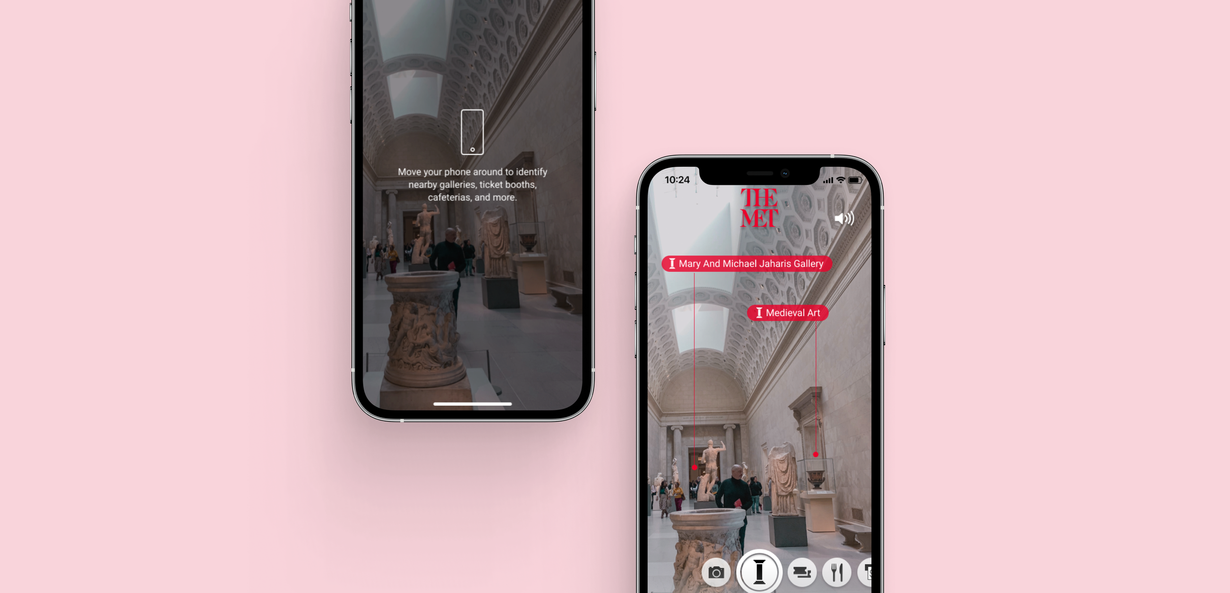
An intimate museum guide experience enabled by an AR app that processes data in the user’s viewfinder to identify nearby landmarks and potential areas of exploration. Visitors can use this information to learn more about specific artwork and select guided tours that appeal to them.
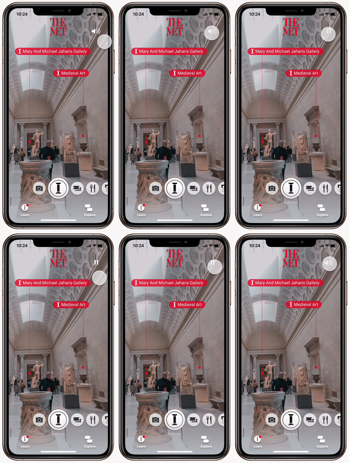
Onboarding experience
User research helped me conclude that users tend to be unfamiliar with Augmented Reality technologies. Through an onboarding experience, users are more empowered to leverage the features that the app offers.
Location identification
Through an interface inspired by Snapchat, visitors can hold their live camera up to interesting locations or areas that they find to identify important landmarks around them.
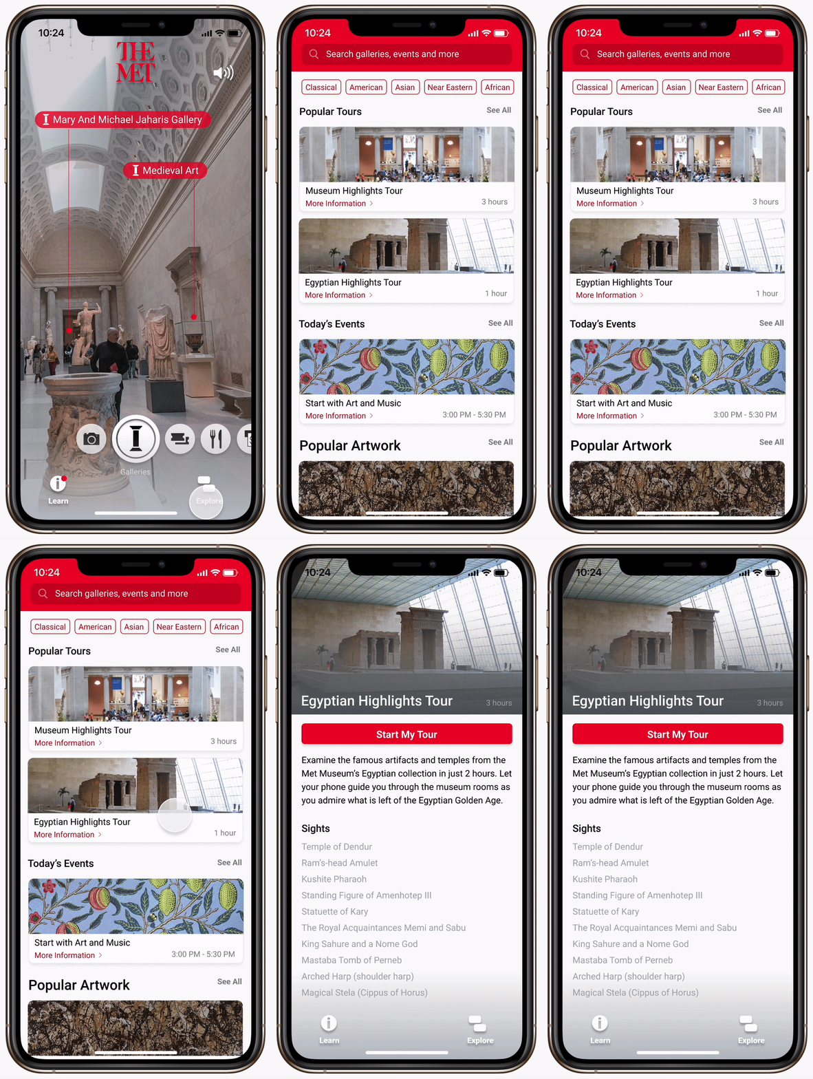
Tour presets
By tapping on a tour, users will be guided to all the not-to-miss sights with just their smartphone.
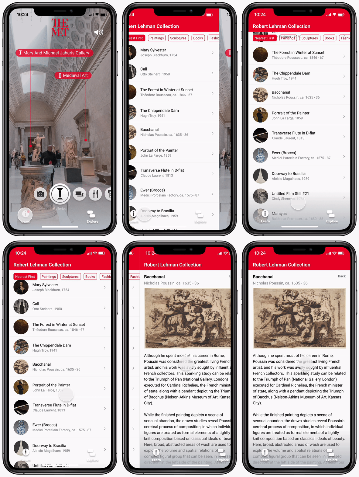
Real-time artwork information
Relevant information about artwork is delivered to the user based on their location inside the museum.
Research
My research comprised of both a museum visit, and interviews of recent visitors.
Observations at the museum
At the Met, I browsed between different rooms to observe visitors. If I encountered visitors experiencing problems with navigating, I took notes and asked them questions (while also obtaining informed consent).
Interviewing past visitors
I spoke to past visitors, including professors and undergraduate students in my archaeology class.
From my research, I was able to gather some information about visitors’ general experience at the museum.
The crowds
The knowledge gained about artwork was minimal as exhibitions were densely packed, making information boards hard to read.
The time crunch
Visitors often missed seeing important artwork because they were in a rush to get to their next scheduled activity.
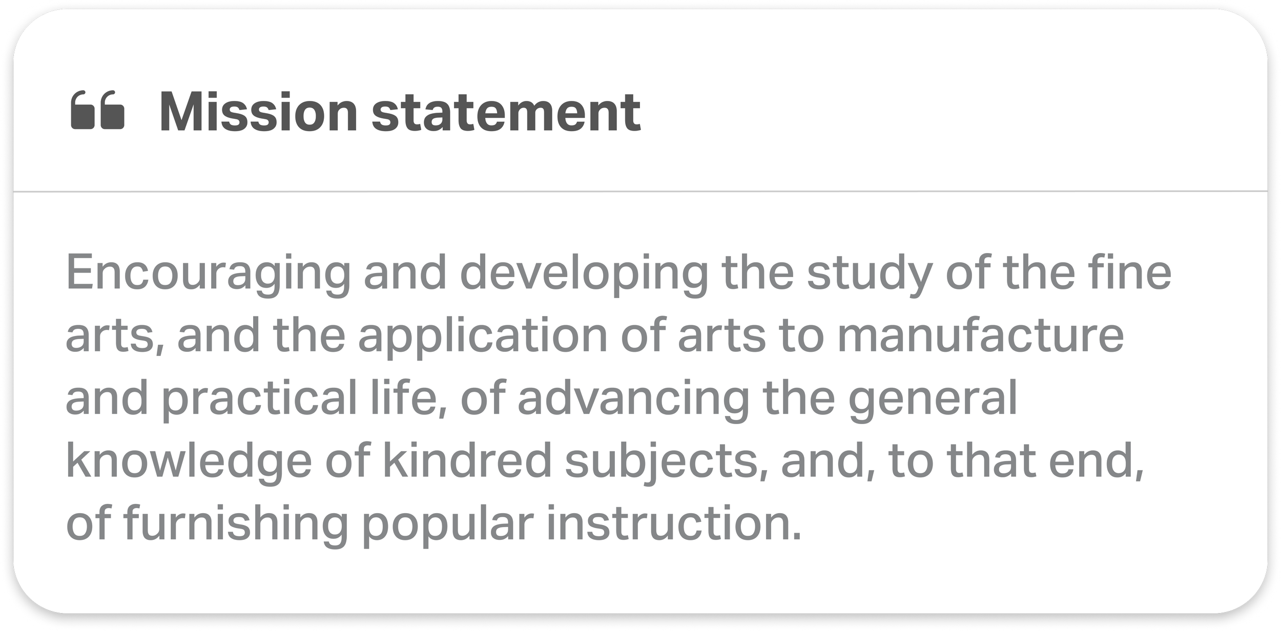
Let’s compare these insights to the Met Museum’s mission statement.
Unfortunately, museum visitors didn’t feel particularly knowledgable after their visit. There was a disconnect between what they hoped to gain and what they actually gained. The Met’s mission was getting lost in the experience, and it was key that this solution brought it to the forefront.
Through speaking with various museum visitors, I also concluded that they generally belong somewhere on the following spectrum:
Synthesis
Then, I started to figure out how all these factors connect to one another to shape the overall visitor experience. I developed personas and created journey maps to find where my solution may fit. As a start, I decided to focus on a specific target audience.
Visitor journeys
After synthesizing the user interviews and defining the problem, I used the value proposition to sketch the personas in their environment.
After mapping out all of this information, I narrowed down the pain points that I wanted to address using How Might We statements:
Problems to tackle
How might we maintain an informative and interactive experience for visitors?
How might we present users with more structure during their museum visit?
Prototyping
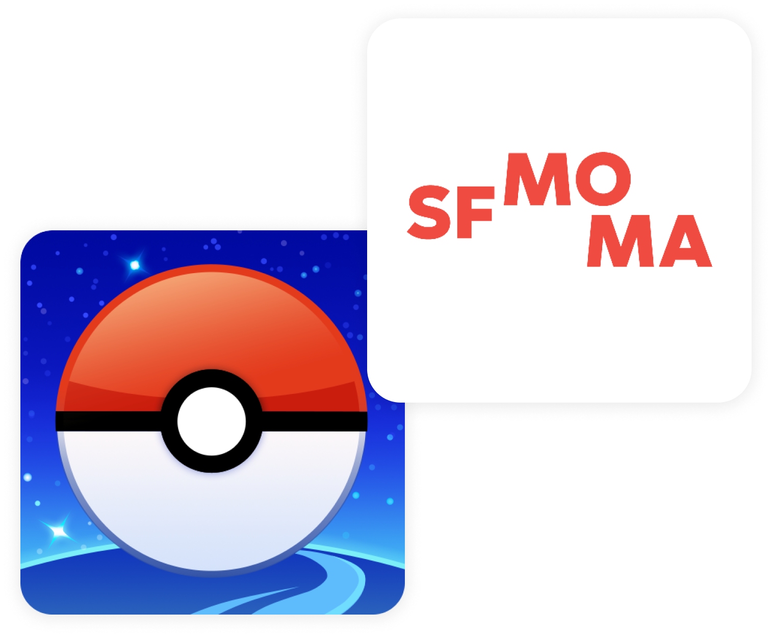
I kickstarted the prototyping process by looking into existing apps and how they engage users. I also looked at existing reviews of these apps to learn more about what users are looking for.
Pokémon GO piqued my interest because of its unique and interactive use of AR technology.
SFMOMA Audio, specialized in museum guides which was very relevant to the planning of my solution.
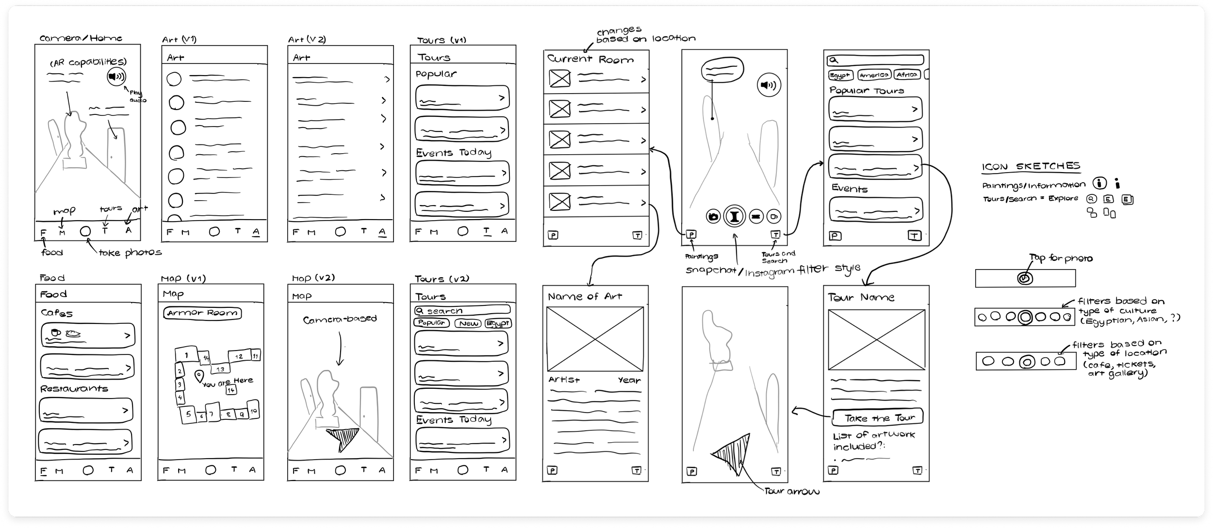
After mapping out an information hierarchy, I also created some medium fidelity prototypes for user testing purposes. Users quite liked the Snapchat style as many were accustomed to it already, and it easily sectioned off different functions of the app.
Design
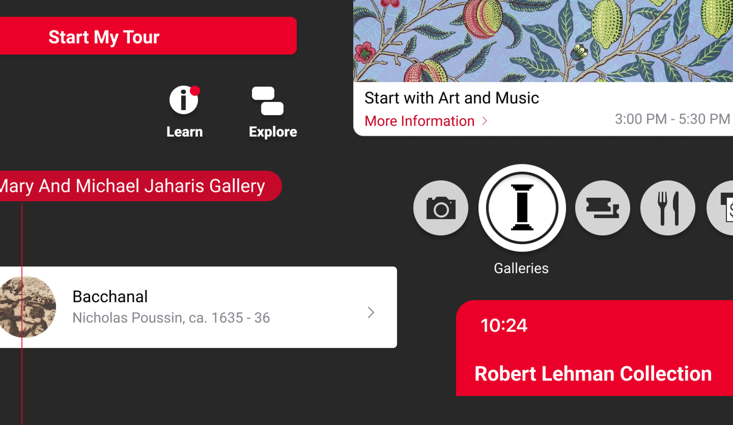
I chose to reuse icons from the Met Museum’s map in order to ensure that repeat visitors who are used to seeing the map are already familiar with the icons on the app.
Font and color considerations
Although the Met Museum is characterized by its use of Serif fonts, I chose to use a Sans Serif font for this app as it is easier to read on a moving screen.
I also chose to use the characteristic Venetian Red for the camera markers to ensure that text stands out amongst the various textures and elements present on the camera’s screen during navigation.
Reflection
Talking to users, I was pleasantly surprised by how many times I heard, “I love the app. It makes me want to visit the Met again!”
Moving forward, I want to explore ways in which I can improve accessibility by adding more audio streams in different languages. With international tourists accounting for 34% of visits to the Met in 2018, it is important that the app is accessible and usable for as many visitors as possible.
As The Met continually finds new ways to entertain its young visitors, I think a child mode for the application would be a great way to keep them engaged and actively learning during their visit.

