March 2020 - July 2020
Met Museum — AR Tourguide

roles
Product designer
skills
prototyping, interaction design, user research.
about
The Met is the largest museum in the United States, housing over 2 million works of art. To say the experience is overwhelming is definitely an understatement. In this case study, I ideate an augmented reality experience focused on navigating users through the expansive museum space with ease and intention.
problem
People want to make the most of their museum visit, but they are often left unsatisfied because:
They spend more time planning where to go next instead of admiring the work in front of them.
They are given a paper map with multiple lines, colors and pages, making it difficult to interpret.
solution
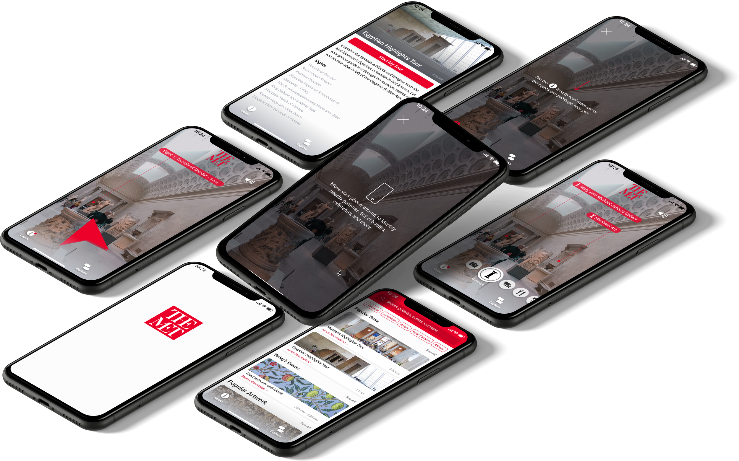
An intimate museum guide experience enabled by an AR app that identifies nearby landmarks and potential areas of exploration through the user’s viewfinder. Visitors can use this information to learn more about specific artwork and select guided tours that appeal to them.
onboarding experience
User research helped me conclude that users tend to be unfamiliar with Augmented Reality technologies. Through an onboarding experience, users are more empowered to leverage the features that the app offers.
location identification
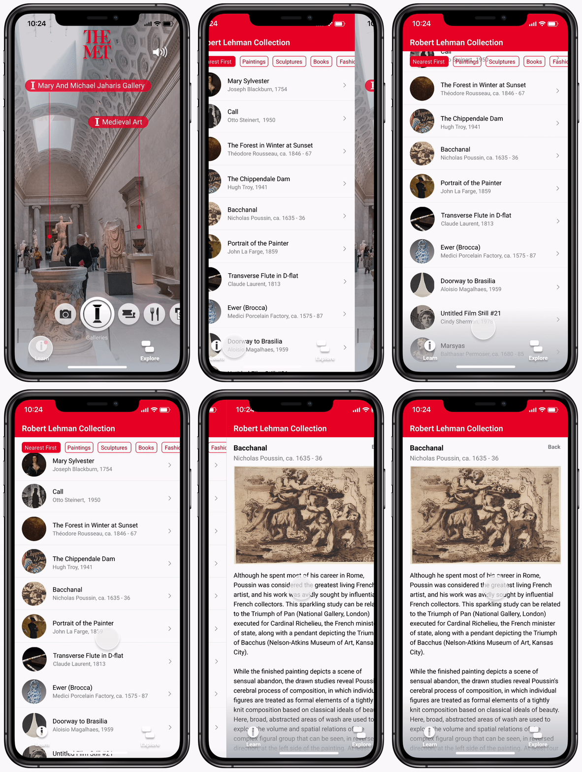
Through an interface inspired by Snapchat, visitors can hold their live camera up to interesting locations or areas that they find to identify important landmarks around them.
tour presets
By tapping on a tour, users will be guided to all the not-to-miss sights with just their smartphone.
real-time artwork information
Relevant information about artwork is delivered to the user based on their location inside the museum.
research
Based on my synthesis, I concluded with 2 main pain points for museum visitors:
The knowledge gained about artwork was minimal as exhibitions were densely packed, making information boards hard to read.
Visitors often missed seeing important artwork because they were in a rush to get to their next scheduled activity.
Let’s compare these insights to the Met Museum’s mission statement.
Unfortunately, museum visitors didn’t feel particularly knowledgable after their visit. There was a disconnect between what they hoped to gain and what they actually gained. The Met’s mission was getting lost in the experience, and it was key that this solution brought it to the forefront.
focus areas
How might we maintain an informative and interactive experience for visitors?
How might we provide users with more structure during their museum visit?
After mapping out an information hierarchy, I also created some medium fidelity prototypes for user testing purposes. Users quite liked the Snapchat structure as many were accustomed to it already, and it easily sectioned off different functions of the app.

visual design
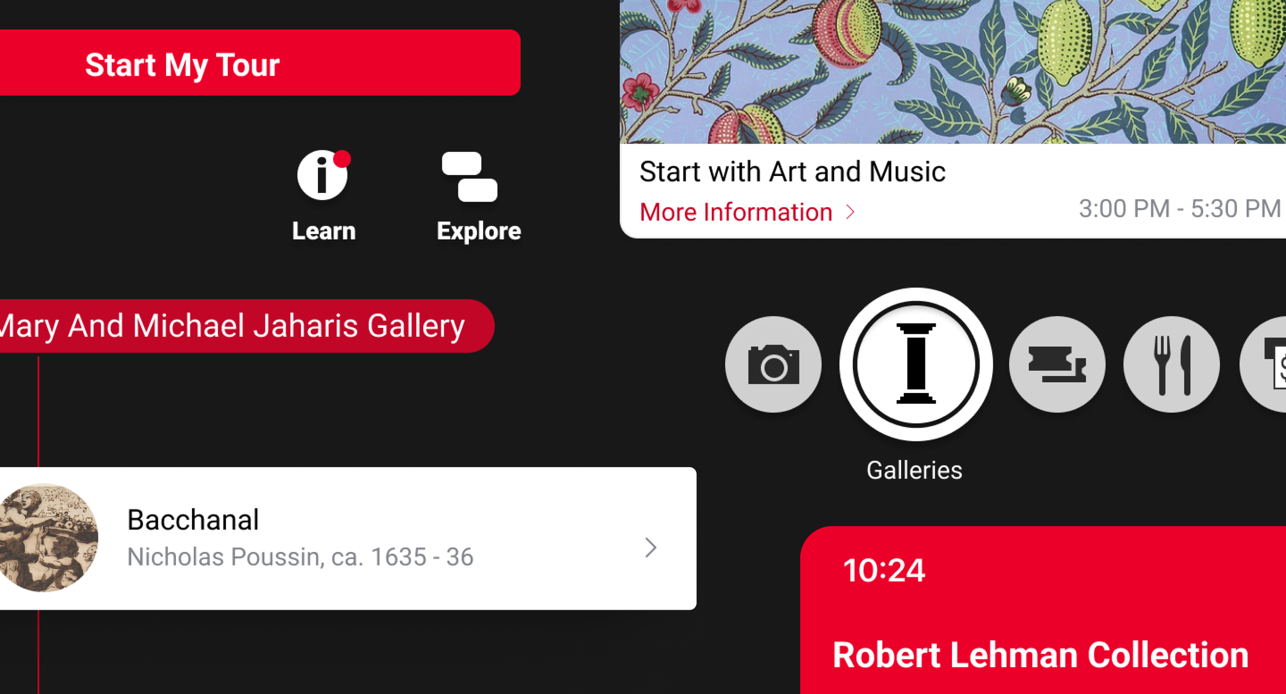
I chose to reuse icons from the Met Museum’s map in order to ensure that repeat visitors who are used to seeing the map are already familiar with the icons on the app.
Although the Met Museum is characterized by its use of Serif fonts, I chose to use a Sans Serif font for this app as it is easier to read on a moving screen.
I also chose to use the characteristic Venetian Red for the camera markers to ensure that text stands out amongst the various textures and elements present on the camera’s screen during navigation.

learnings
Talking to users, I was pleasantly surprised by how many times I heard, “I love the app. It makes me want to visit the Met again!”
As The Met continually finds new ways to entertain its young visitors, I think a child mode for the application would be a great way to keep them engaged and actively learning during their visit.


